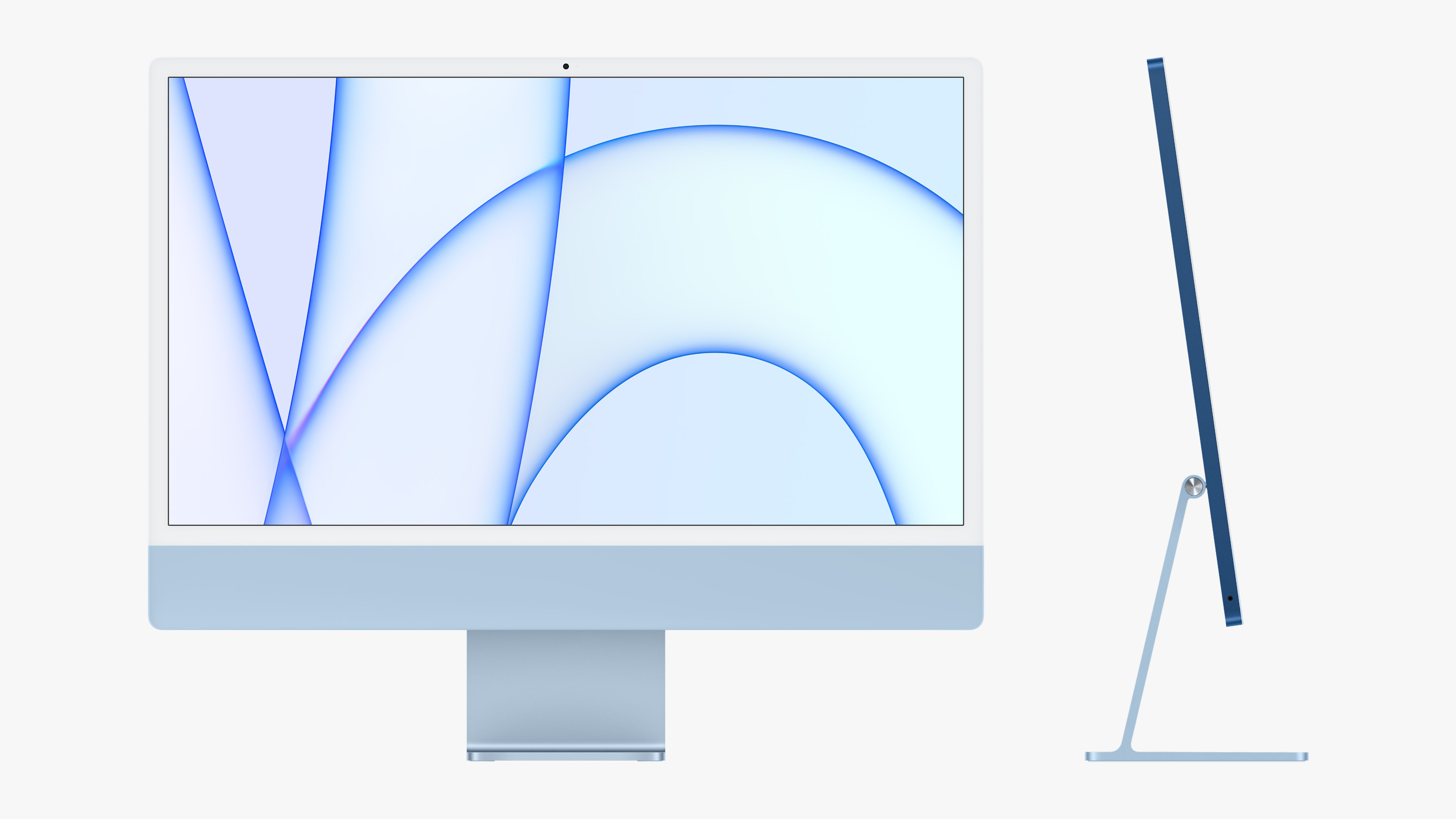
iMac estrategy and marketing position
I do not like them, but they are fantastic
I do not love the iMac with bright colors. I think they look childish. It would be nice to have one of those for some weeks but not for some years. Probably I am not the target audience. Perhaps they are ok for some kid's bedroom or a fashion store.
I am aware that they have a silver version that could fit better in more conventional environments, but still, the bright colors take a lot of attention when the user has to decide.
The bezels are still too big in these times, and the fact that they are white makes them feel bigger. When they decide to go with the bright colors, white bezels become necessary.
I do not care that if the whole computer is so thin. The chin looks strange and out of place, more than ever. If those two things are related, I do not think it is a good trade-off.
So, what is the conclusion about the new iMacs? I love them! There are some things I do not like about this line, but still, there are so many elements that are well thought. I appreciate that they tried some risky new things. They have strong personality.
I understand that Apple is a big corporation and has to satisfy a big audience. So those iMacs will have their audience. Also, the screen quality and the processor's performance will be outstanding. That will be especially remarkable for a low, commercial line.
Posts about Apple marketing. You can read each one independently:
- Apple Vision Pro Marketing Strategy - Apple black color marketing - Pararells between Apple and OpenAi - "Pro" marketing strategies - Some books about Apple - The iMac position in the market - The marketing of bold innovations - Dress for a special moment - Many question around a key figure in Apple - The marketing of the monitor - Pro brand - Touch Bar and marketing - The brand of Apple products - Apple environment and brand - The Apple robots, the environment and the brand - The marketing aspects of the 3D touch technologyAll the posts